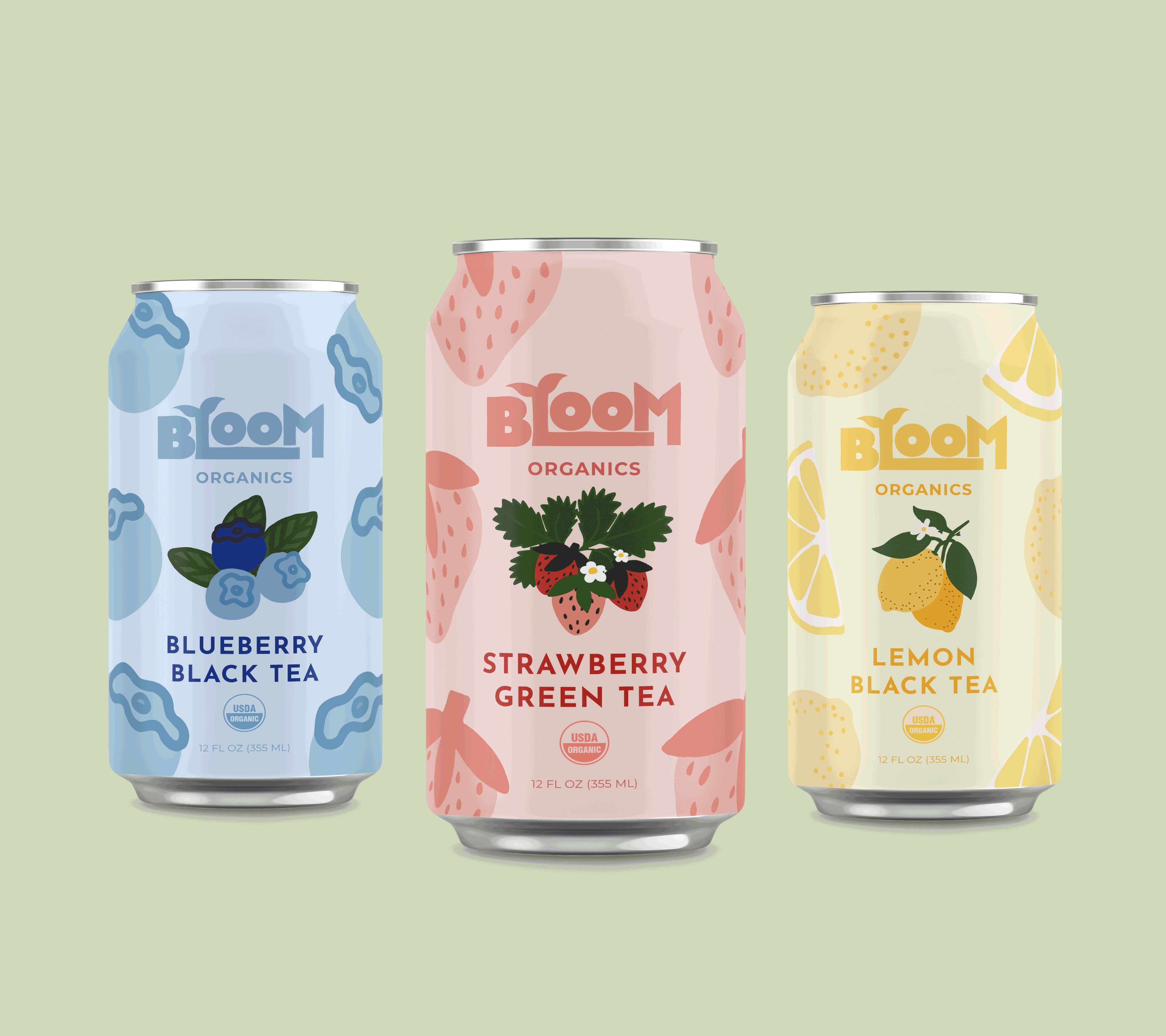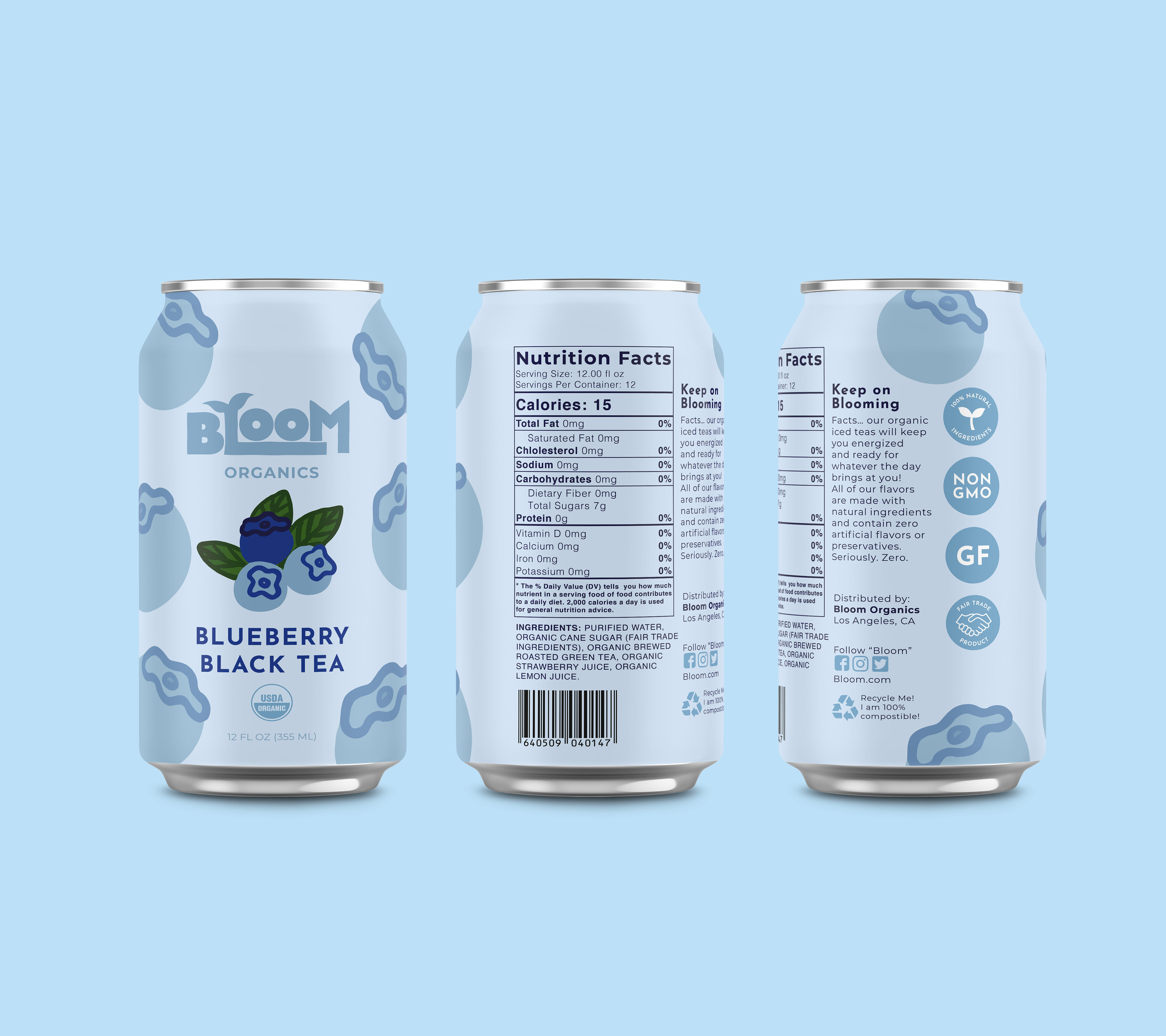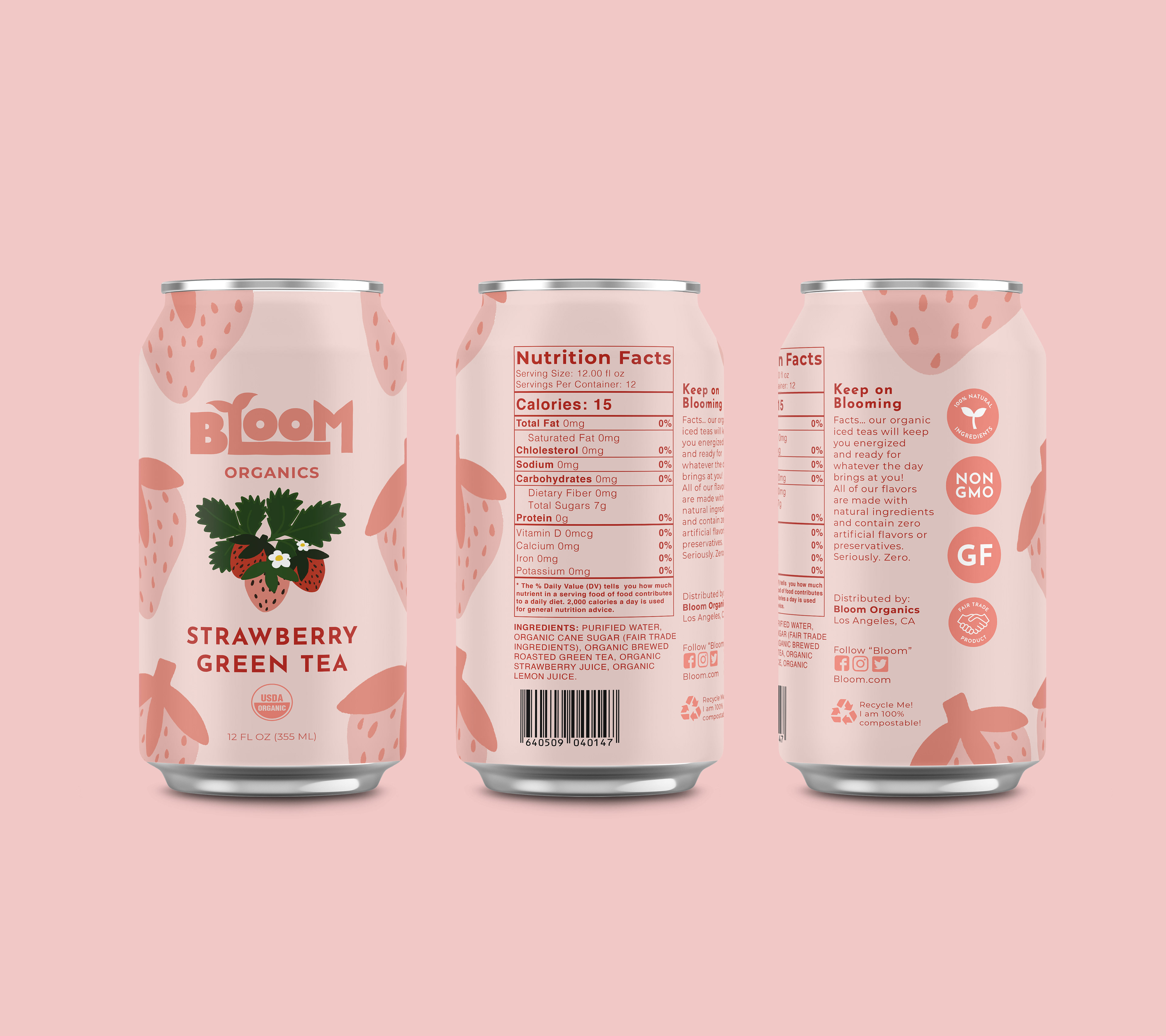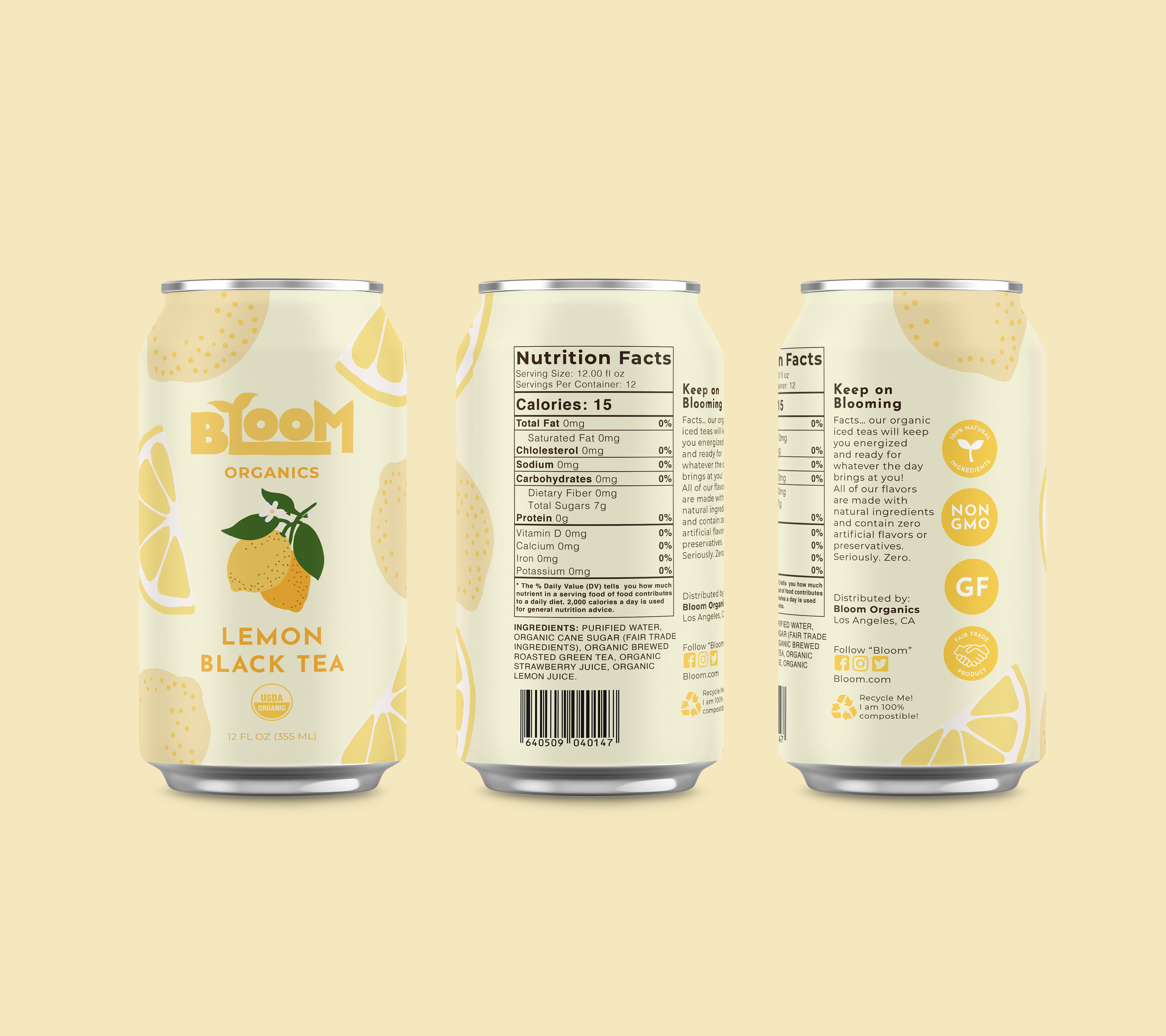
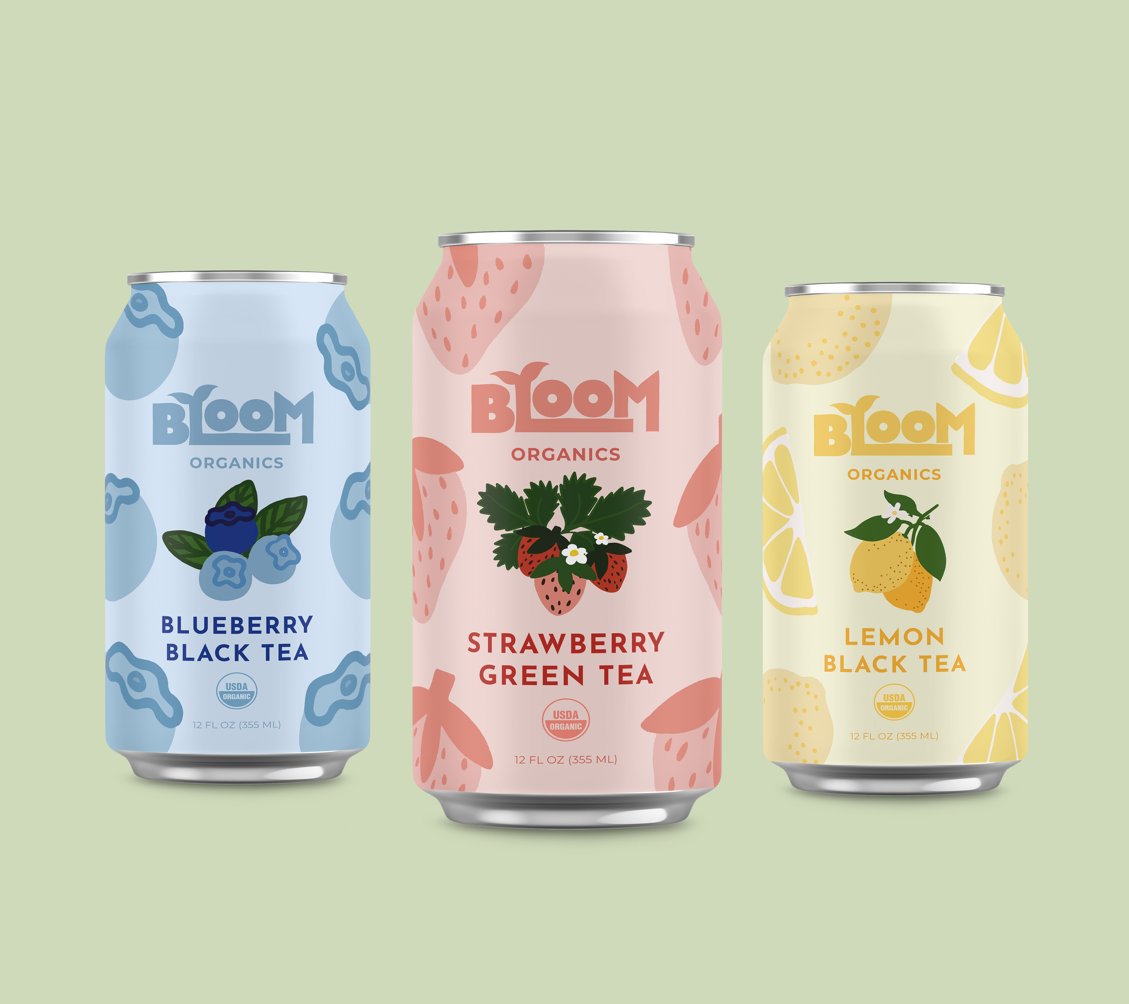
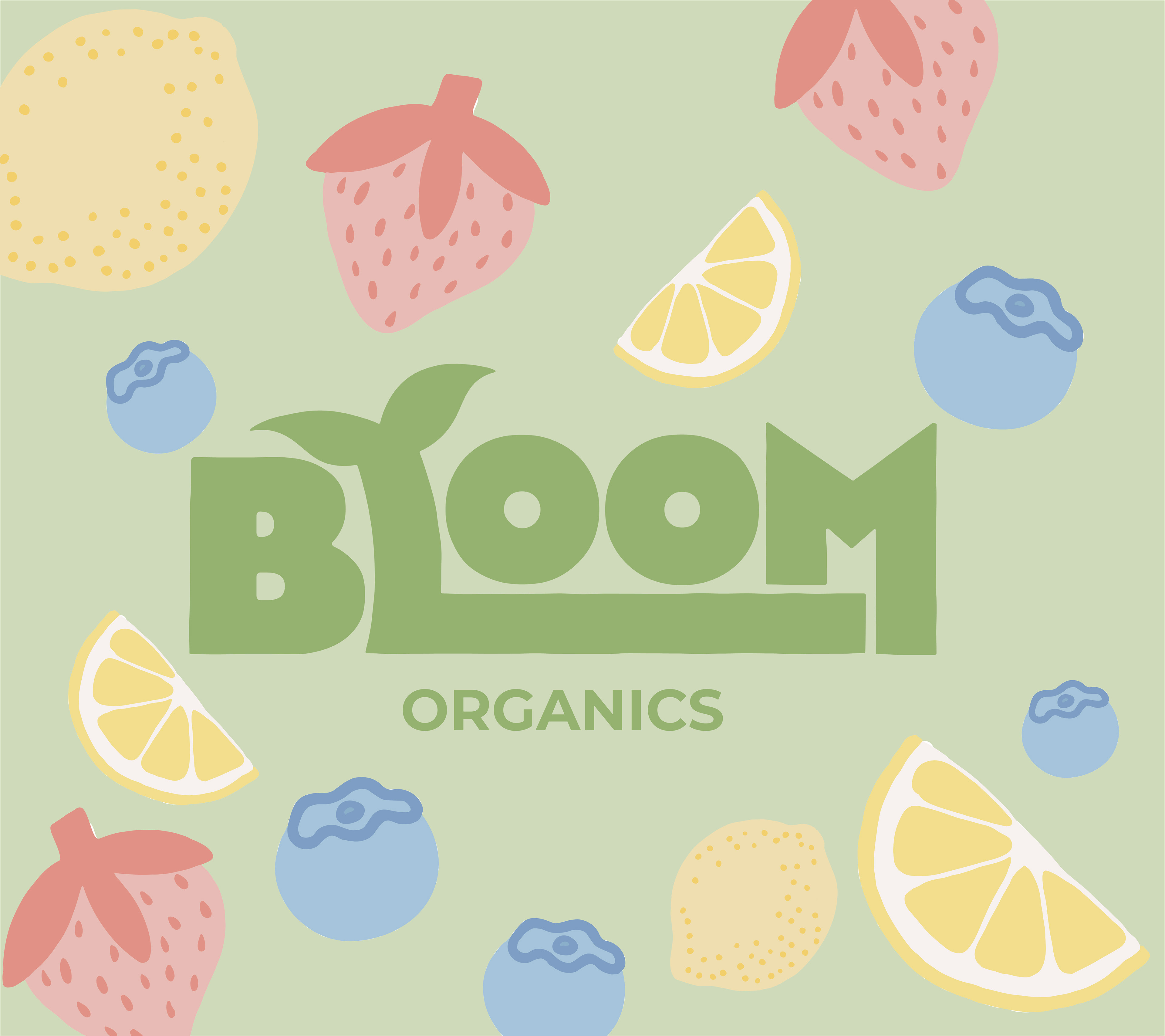
Bloom Organics was a project I had created because I wanted to experiment with designing a bright and inviting packaging design. The Bloom logo has a sprout growing out of the "L", symbolizing the growth one will experience when having a taste of this fruitful iced tea. This project is a reflection of my own personal "style" as a designer, I enjoy creating warm and honest work that creates a comforting experience for any user.